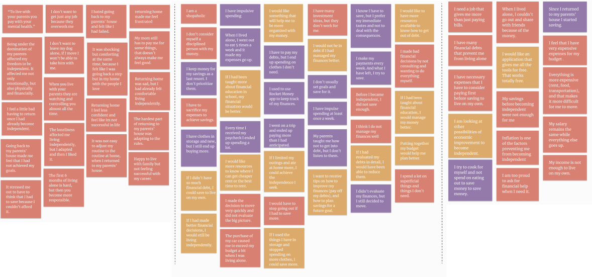
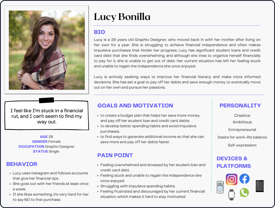
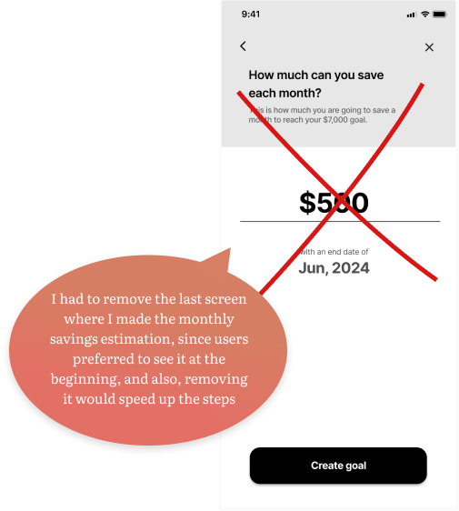
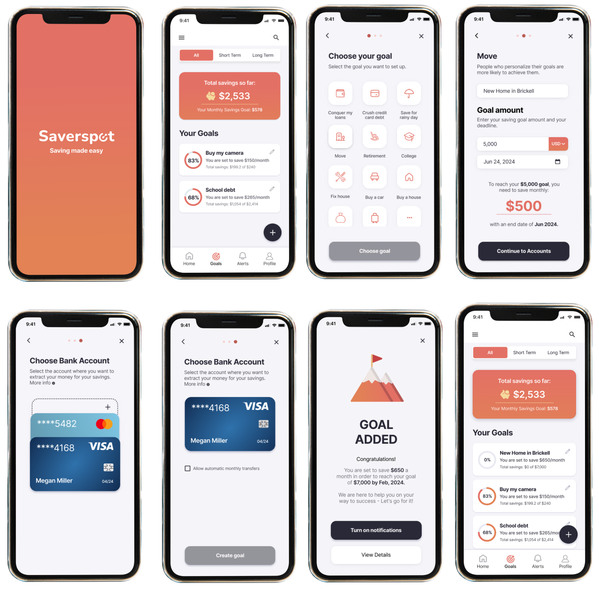
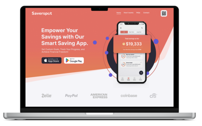

OVERVIEW
10 weeks timeline
iOS platform
Tools: Figma | Adobe Illustrator | Otter.ai
What’s the
problem?
achieved financial
independence by the
age of 31.
or less in savings.
dependent on their
parents.
explore and gain a deep understanding of millennials’ attitudes and perceptions toward independence.
obtain more data on my research, I will send surveys to people who might be involved in this problem
- Men and Women
- Age: 25-40
- Currently be living with their parents or other family members
- Desire to live independently
- Should have at least a high school diploma
- They must live within the u.s.
- People who move out, and then return to their parents’ home.


Occupation: Unemployed
Level of education: Marketing Master’s Degree

Occupation: Waitress
Level of education: High school diploma

Occupation: Sales area
Level of education: Bachelor’s
degree
surveys with potential users who met specific criteria. During this process, I
categorized pain points, motivations, and behaviors into distinct themes.

relevant insights I understand about users:
generally lack financial
literacy and knowledge.
millennials may
prioritize immediate
gratification.
may have different
attitudes toward money
previous generations.
focused Design Challenge that would address the key pain
points and needs of users.
achieve financial independence so they feel more
settled in adulthood?
characteristics, needs, and goals. It helps me find the best way to meet my users’ needs.

During my research, I discovered that a common issue users face is: struggling with savings.
her save more money.
so that I can feel that I am making progress.

translation of the application. I created multiple versions, and the selected sketch
served as the foundation for my wireframes.


bank account


Lo-Fi Prototype
which allowed me to test the basic functionality of the app and refine the design.


adding a new goal. However, after carrying out the Usability Test Plan, these are some design
corrections that I had to make to my first Lo-Fi Prototype to obtain a better interface result.


start branding and the Hi-Fi Prototype in the next steps.

improve the goal setting process and make it faster.

Let’s begin with the
branding design
This is where the design comes to life. Now I
will work on the branding, mood board, color
extraction and injection.
that best aligned with the personality and values I wanted to convey with my app.


feeling of trust, reliability, and modern style. The main color grabs your attention, and I’ve used a
light color for the background to keep things clean and modern. For the CTA buttons, I went with a
darker color that contrasts a bit with the main one.

Palette Builder to choose a color palette that works well for everyone.

Name and Logo
I have carefully considered various options for the name and logo. After brainstorming and conducting
research, I have decided on the name “Saverspot” as the best option.
The word “Saver” clearly communicates that my app is designed to help users save money. It’s a common
word that most people will recognize and understand immediately. On the other hand, I chose “Spot”
because it sounds so focused and specific like my app is the one-stop-shop for all your financial needs.
The “S” sound makes it easy to say and remember, which is important for building brand recognition.